Engaging Sports Fans with Crypto
Binance Fan Token was created to provide sports fans with an interactive platform that utilizes blockchain technology to participate in sports club events. However, racing and football fans found the utility difficult to use, leading to a 70% drop rate. I was brought onto the team to address this issue and improve user adoption.
Contributions
UX Design, Data Analysis, Survey, User Interview, User Flow, Persona, User Testing, Figma
Meet My Team
Lida L., Product Manager
Sinem S., Marketing Specialist
Lorenzo C., Operation Specialist
Timeline
May 2022 (8 weeks)

Thanks for viewing!
To see more process, rationale, and research details, please visit
👉 this deck
Binance “Fan Token” is a Crypto Product for Sports Fans
Project Overviews
Binance, a Cryptocurrency Exchange Platform
Binance, one of the world’s largest cryptocurrency exchanges, has a global user base of 120 million registered users. In its ongoing efforts to attract non-crypto users, Binance identified a potential audience of 280 million racing and football fans to bring onto its platform.
The target users, namely racing and football fans, struggle to understand how to utilize the Binance Fan Token effectively, resulting in a staggering 70% user drop-off rate.
Low User Adoption Rate Due to Overwhelming Information

Boosted User Adoption: Click-through Numbers Increased by 12 Times
Impact
Simplified Onboarding flow for Complex Crypto Features
I based my design decisions on user research, considering the launch timeline and development resources.
Increased Cross-functional Sync Efficiency
I increased cross-functional (XFN) team members' alignment by facilitating task prioritization workshops.
Intuitive, Engaging, and Feasible
Design Requirement
As the sole designer responsible for user research, I not only had to make informed design decisions but also had to mentor my internal stakeholders with the user research findings. To address this, I clarified the ambiguity through surveys and interviews to understand the user needs and design requirements.
Frustrating to search for utilities
The platform has too many features and explanations, and the utilities are not highlighted. We need to increase the visibility of utilities to eliminate the time users spend searching for them.
User Research Insight
Design Requirement
Help users prioritize the utilities they can experience and create a streamlined experience.
Unsure how to use Fan Token
Too Confused to Get Started with the Binance Fan Token Utilities
User Problem
Target users unfamiliar with blockchain tokens and utilities
They are tech-savvy but not crypto savvy.
Too many utilities overwhelmed new users, leading to low usage.
The abundance of features made it difficult for new users to navigate the app, causing confusion and discouraging them from fully exploring or utilizing the platform.

Solving Fan Token
User Confusion
Problem Statement
How might we simplify the user experience and help users prioritize utilities on the Binance Fan Token platform to increase adoption and engagement, especially for crypto novices?
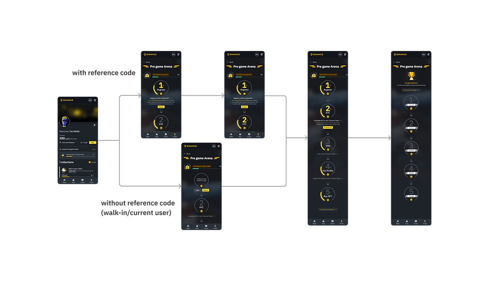
Streamlined User Flow
First Draft Prototype
After the user flow was defined, I decided to draft a mid-fi prototype instead of a wireframe or low-fi prototype because at the same time, our team was working on the design components for the new features. This approach ensured the accurate information perception.

Quick Testing with Internal Research Panel
Usability Testing Results
I conducted the usability testing with participants from the internal research panel. Follows were the insights for me to iterate designs.
High
Priority
Medium
Usability Testing Insight
Only 33% of the users can find the "message bar"
Badge design didn't look collectable
Design Requirement
Redesign the message bar with different visual elements to ensure its visibility on a functionally complex page
Research the design principles for badge design and iterate on the existing design


The message bar to be redesigned
The badge to be redesigned

Iteration Based on the Usability Testing
Second Pass
At this design iteration, I crated iteration for the message bar and badge design based on the usability insights.

Tweaks to Message Bar & Badge Information Delivery
UX Review & Iteration
After reviewed by the design team and PM, I identified two issues for further iterations:
1. The message bar offered confusing UI elements
2. Redundancy to go back and forth to see each task regulation
The message bar offered confusing UI elements
Issue 1
Many users are new to the platform and unfamiliar with its features. Therefore, it’s crucial to enhance the visibility of the onboarding message bar within the dense interface, allowing users to easily spot it. This gives them a better chance of being converted into regular users.
Redundancy to go back and forth to see each task regulation
Issue 2
My initial design aimed to help users unfamiliar with crypto products by redirecting them to detailed explanation pages. However, this approach increased users’ cognitive load. Instead, I provided concise explanations on the same page while still offering a link to the full details.
Quick Summary with More Details Available
Solution


1. Task not selected will have no outline
2. Information button will be folded
1. Task selected will have a yellow outline
2. Brief information will show up when selected
3. Call-to-action button will show up when selected
Modify components design with minimum cognitive load
Solution


-
The icon’s meaning is unclear
-
Too much information is provided in the relatively small space
Before 1
Before 2
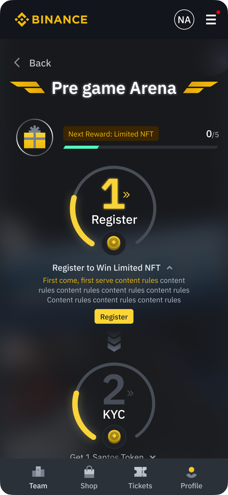
Final Solution
1. Using the current reward icon to represent steps is intuitive, but it lacks proper guidance
2. Leveraging the stamp card metaphor to engage fans is great, but too much information is presented in a relatively small space
2. Presenting just the right amount of information
1. Using the current reward and badge design elements to create an icon for the steps is intuitive
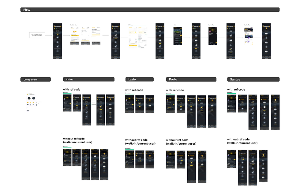
Communicated with XFN Team Members
Design Handoff

Gamification onboarding user flow to engage non-crypto savvy users
Final Deliverables

